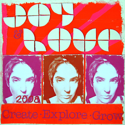
I loved the font that Lara chose for this layout!
Its very geometrical, and unique. Reading the techniques and products that went into this layout was really interesting. I love the monochrome going on, and to me its very Andy Warholish. What a great take on Prompt #1.


8 comments:
this is awesome!
WoooW this is FAB!!!!!
wow love these colors-great page
Fantastic! This really stands out.
I'm in love with the type and the brightness here - LOVE.
fab! great use of shapes & the colors are bold! love it!
cool - thanks y'all!!!!!
:D :D :D
so happy for this blog and all its inspiration - for real!
this is out of this world!
Post a Comment