I think this blog is now chock full of creative, fun, outgoing, inspiring girls.
Yay for 21:)


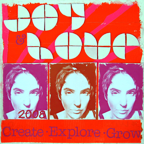
I loved the font that Lara chose for this layout!
Its very geometrical, and unique. Reading the techniques and products that went into this layout was really interesting. I love the monochrome going on, and to me its very Andy Warholish. What a great take on Prompt #1.

 *click on image to enlarge.

 ... a dipping pen and ink! Now I actually learned to write using pen and ink-(that's showing my age!) but I haven't used one since primary school. Well, it's just fantastic writing with this little beauty. Suddenly I can do that fancy loopy writing like all the famous scrapbookers! I can do italics too! I love it so much I'm going out to buy some different sized nibs. Why not try it for yourself?


Click here for a bigger version. Don't worry, sometimes I like some "cryptic" journaling!

It is a stark reminder, to me, not to waste time and not to grumble about not having enough, and oh my goodness I didn't use colour!!!!!
So I hope this inspires you to take those thoughts and run with them, to just let the gates fly open and create.


 hey crazy kids!! just wanted to pop in here very quicky to post my take on the first challenge. i'm so dazzled by the pages so far - so much so that i got stage fright when i went to do mine. lol. well i finally got enough mojo last night to finish it. my page is based on this ben harper {heart him} poster. didn't re-invent the wheel here - it's pretty much a stratight-up jack but i loved the retro 70's basement feel to it so i didn't want to stray too much! thanks to all for your submissions so far and a big hi!!!! to the other typists!! don't forget to hook up your pages to the flickr group! xo sandy

 i printed a picture of myself and trimmed it


 I was drawn to the colors and the shapes and, of course, the simplicity of the lettering. so here's what i did
 I love the look of this poster especially all that lovely type. Here is my take on it:
For this I went completely digital, I still love my paper crafting best but it's fun to mix things up a little bit. I took the picture of myself and cut out the background, then I did a gradual softening of the edges to help it blend into the poster background. Next I picked out my lovely type, I choose more "fun" fonts for most of this to reflect my personality. I hope this helps give a little inspo to everyone.
Also I stumbled upon this site today called ~ Ork Posters, they make awesome typographic posters of different cities. You have to check them out:

 I hope everyone has a great weekend & remember to upload your projects no later than September 6th.
xo, April

I loved the vintage feel and that the type is handwritten. Now I can't do lettering like that-you would need to be a trained signwriter I think, and I'm not sure whether signwriters even exist anymore in this digital age, but I did enjoy doing a totally handwritten poster. I also decided to carry the poster theme through to the journalling style, which I've tried to do in a movie trailer style. (Are they called trailers internationally? I used to call them 'shorts' when I was a kid. Anyway I'm rambling on about the movie previews that advertise films that are coming soon.) Here's my take:
 The journalling reads:
She lived an ordinary life-married, 2 kids, a house in the suburbs.
She enjoyed simple things-countryside walks, gardening, being alone.
She dabbled in arty stuff.
She hated injustice and queues and housework.
She lived an ordinary life, and yet.......
..it made her extraordinarily happy.
It's great to see some fantastic work appearing on in the flickr gallery too. Keep them coming!!

Well this here green poster below is my inspiration

And this here below is my version :)

What have I done?
Ive altered a photo of myself in Photoshop elements [crop/black and white/pixelate filter +++ with added effect with Crystal filter]. Printed it to fit the whole page {Kraft CS}, and used a combination of letter stickers {Doodlebug hopscotch} and Rub-ons {MME distressed} for the title and text. Border is with corrective tape and Zig pen.
Well comon guys, get creative, I so cant wait to see what YOU DO!
Lou :)xxx


 hey everyone! sandy here! just thought i'd put a little inspo i came across today here for your entertainment and give poor patty a well-deserved rest! i came across this fun little tool today and thought it might give you all a great reason not to do the dishes, or laundry, or even scrapbook *gasp* for a good half-hour. it's all about words and might give ya all a little boost for the first challenge. have fun! p.s. the one above is from my blog - and patty's name made it's way on to it! go try it, it's really cool.
 Bottom reads: